Flanker Ruano
Raffaello Bertieri, one of the most influential ideologues of the Italian typeface sciene of the fist XX Century, had the opportunity to admire one of the copies of the treatise of the Spanish calligrapher Ferdinand Ruano, titled Sette Alphabeti di varie lettere (Seven Alphabeti of various letters), and he remains fascinated by the chancery letters. Thus did the complete alphabet with uppercase, not present in the original font, and, in 1926, the Nebiolo Foundry published Ruano: a rare example of chancery writing completely vertical.
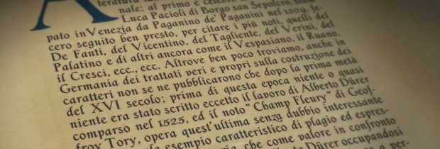
Bertieri later serialized on Archivio Tipografico (Typographic Archive), the journal of Nebbiolo, a long article (De’ più noti scrittori di caratteri e calligrafi italiani nel Cinquecento, About the best-known Italian writers and calligraphers in the sixteenth century) that explained the long work and the analysis of the treatise.
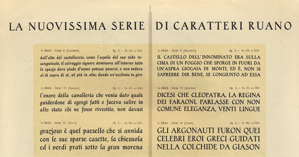
On MyFonts it is published the result of a patient work of reconstruction to a digital font of the body 24 from the catalog of the nuovissimo carattere (brand new character), dated 1927, which you can find some pictures on this page. Some missing glyphs – i.e. the ampersand, fl, ae and oe ligatures, have been reconstructed from photographs (unfortunately not so good photo). The guillemets, the sign of paragraph, the number sign, the dagger and the various currency symbols have been designed from scratch.

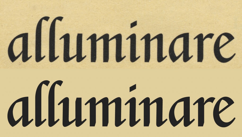
Comparison of the original (top, body 48) with the digital reconstruction (below, body 24). Note the difference in thickness of the thin strokes due to the difference of the body.
In the future it may be possible, and indeed desirable, to be able to reconstruct a display style (larger body) and a caption style (smaller body) of the font.
Here at the bottom you can download the catalog used as a model for the reconstruction of the typeface.


