Semplicità Bold
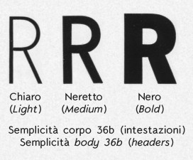
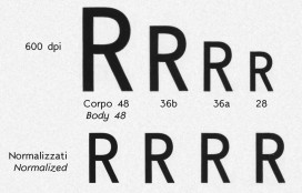
And finally Semplicità nero (Bold) has its digitalized version. As for the other two series (Light and Medium) is made from the body 28 images.
We found significant differences compared to the other weight: first, the x-height (and thus the height of all lowercase letters) is greater than the other two thicknesses, compared to the height of capital letters.
In addition, the height of the case is different, with the same body, by 1% from the Light series to Medium and 7%, rising from the Light to Bold. We have instead preferred to maintain the heights of the three series constants, comparing these to the rest of the character (ascendants, descendants and x-heights).
One of the characteristics of the Semplicità is the pronounced height of the ascenders, compared to the limited projection of the descendants. In the Bold series the height of the ascenders decreases (about 3%), plus there is also a different height of the b and the d than the other ascendant, these two glyphs are lower by more than 7%.
The whole package is available below or in the original article.


