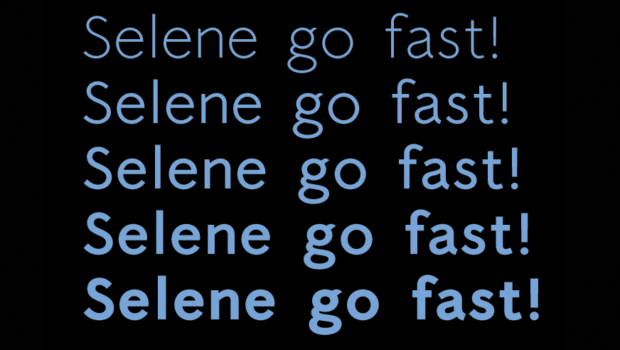
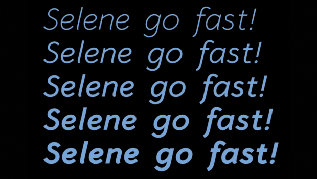
Selene new weights
New look, revised and corrected, of Selene. We have added also other weight: light and semi-bold (MyFonts).
When we decided to create this new font, we had in mind geometric design, absolute shapes and that the letters would take over the forms of classical literature printing, such as the lowercase g with the bowl. The same philosophy was followed for the Italic version, where the lowercase letters have been designed imitating the calligraphy style, lik for the lowercase f with the descendant.
The only distinguishing trait that we treated ourselves to, and only when absolutely necessary, is that particular pointed flare in the terminals of the lower case (Italic i, n and l for example).


