Flanker Garaldus
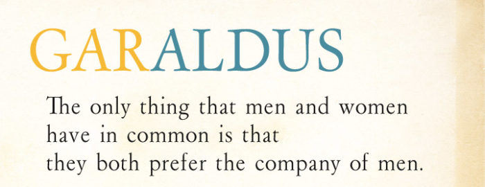
Finally published on MyFonts and for the first time in digital format, the Garaldus of Aldo Novarese! The Garaldus was introduced in 1956 and has a design inspired by the proportions of the Venetian tradition of the sixteenth century, in particular Garamond and the Aldinus fonts by Francesco Griffo, hence the name of the font.
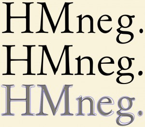
A special feature of this character was to change appearance according the way it was printed and the paper on which was engraved presenting a more or less angular shapes despite the glyphs are fully rounded (for example you can look these pictures found on Flickr) . Perhaps this was one of the reasons for the low success of this typeface.
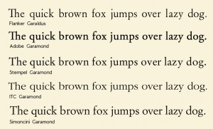
The publishing house Einaudi, who wanted a Garamond for his editions, decided to design specifically a new type: the Simoncini Garamond, designed by Francesco Simoncini between 1958 and 1961 and based more on the version of Jean Jannon.
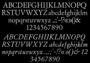
The font contains both normal nubers and text figures, ligatures between QU, qu, QV, e qv, already in the original, ligatures Th, ch, ct, ff, fi, fl, ffi, ffl, ffi, ß and st specially created and other glyphs.
