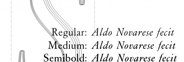
Garaldus all styles!
We have added two more styles to Garaldus (see MyFonts page), which now lacks only the small caps. In addition to the new styles – medium and semibold – have been fixed some small imperfections (for example, the letter c differed from the original in the final part of the curve) and, above all, was corrected the contrast of the bold, erroneously low because of that it was taken as a model an original small caps glyphs.
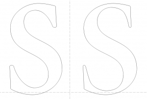
In the opening picture you can see an example of the four styles, while below you can find a comparison between the first and the current bold.


